1. Concepts
1.1 Confusion matrix
An NxN table that summarizes how successful a classification model's predictions were.
It shows the correlation between the label and the model's classification.
N represents the number of classes.
In a confusion matrix, one axis is the predicted label, and one axis is the actual label.
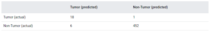
An example when N=2
actual tumors: 19
tumors correctly classified (true positives): 18
tumors incorrectly classified (false negative): 1
non-tumors: 458
non-tumors correctly classified (true negatives): 452
non-tumors incorrectly classified (false positives): 6
1.2. True vs. False and Positive vs. Negative
Considering the example is based on The Boy Who Cried Wolf story.
Let's make the following definitions:
- "Wolf" is a positive class.
- "No wolf" is a negative class.
A true positive (TP) is an outcome where the model correctly predicts the positive class.
A true negative (TN) is an outcome where the model correctly predicts the negative class.
A false positive (FP) is an outcome where the model incorrectly predicts the positive class.
A false negative (FN) is an outcome where the model incorrectly predicts the negative class.
True/False is predicted
Positive/Negative is ground-truth
1.3 Accuracy
For Binary classification
Dataset has 100 tumor examples, 91 are benign (90 TNs and 1 FP) and 9 are malignant (1 TP and 8 FNs)
Consider the first model:
- In 9 malignant tumors, the model only correctly identifies 1 as malignant
- In 91 benign tumors, the model correctly identifies 90 as benign
Consider the second model that always predicts benign. It also has the same accuracy (91/100 correct predictions).
The first model is no better than second model that has no predictive ability to distinguish malignant tumors from benign tumors.
=> Accuracy doesn't tell the full story when you're working with a class-imbalanced data set, where there is a significant disparity between the number of positive and negative labels.
1.3 Precision and Recall
Precision: What proportion of positive identifications was actually correct?
In all positive cases how many positive cases are correctly predicted?
when it predicts a tumor is malignant, it is correct 50% of the time.
Recall: What proportion of actual positives was identified correctly?
In all positive predicted cases how many positive cases are correctly predicted?
when it correctly identifies 11% of all malignant tumors.
improving precision typically reduces recall and vice versa.
Consider Classifying email messages as spam or not spam when changing threshold.
When the classification threshold is increased, the certainty is increased and FP is decreased so Precision is increased. In other hand, we predict more cases as Negative but the probability that is False is increased and Recall is decreased.
Q: If model A has better precision and better recall than model B, then model A is probably better.
A: In general, a model that outperforms another model on both precision and recall is likely the better model. Obviously, we'll need to make sure that comparison is being done at a precision / recall point that is useful in practice for this to be meaningful. For example, suppose our spam detection model needs to have at least 90% precision to be useful and avoid unnecessary false alarms. In this case, comparing one model at {20% precision, 99% recall} to another at {15% precision, 98% recall} is not particularly instructive, as neither model meets the 90% precision requirement. But with that caveat in mind, this is a good way to think about comparing models when using precision and recall.
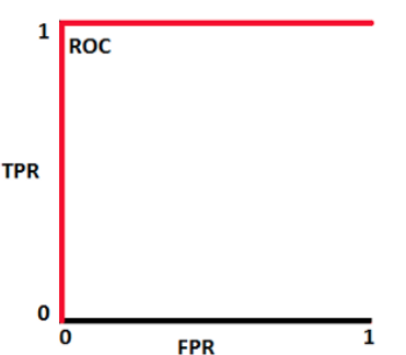
1.4 ROC curve
ROC curve (receiver operating characteristic curve) is a graph showing the performance of a classification model at all classification thresholds.
The 2 axes:
- True Positive Rate
- False Positive Rate
Lowering the classification threshold classifies more items as positive, thus increasing both False Positives and True Positives.
To compute the points in an ROC curve, we could evaluate a classification model many times with different classification thresholds, but this would be inefficient. Fortunately, there's an efficient, sorting-based algorithm that can provide this information for us, called AUC.
How to use the ROC Curve?

We can generally use ROC curves to decide on a threshold value. The choice of threshold value will also depend on how the classifier is intended to be used. So, if the above curve was for a cancer prediction application, you want to capture the maximum number of positives (i.e., have a high TPR) and you might choose a low value of threshold like 0.16 even when the FPR is pretty high here.
This is because you really don’t want to predict “no cancer” for a person who actually has cancer. In this example, the cost of a false negative is pretty high. You are OK even if a person who doesn’t have cancer tests positive because the cost of false positive is lower than that of a false negative. This is actually what a lot of clinicians and hospitals do for such vital tests and also why a lot of clinicians do the same test for a second time if a person tests positive. (Can you think why doing so helps? Hint: Bayes Rule).
Otherwise, in a case like the criminal classifier from the previous example, we don’t want a high FPR as one of the tenets of the justice system is that we don’t want to capture any innocent people. So, in this case, we might choose our threshold as 0.82, which gives us a good recall or TPR of 0.6. That is, we can capture 60 per cent of criminals.
1.5 AUC (Area under the ROC Curve)
AUC near to the 1 which means it has a good measure of separability. A poor model has AUC near to the 0 which means it has the worst measure of separability. Some importtant features:
- It is threshold invariant i.e. the value of the metric doesn’t depend on a chosen threshold.
- It is scale-invariant i.e. It measures how well predictions are ranked, rather than their absolute values.
Consider some cases when plotting the distributions of the classification probabilities.
A perfect classification when when two curves don’t overlap. It can distinguish between positive class and negative class.
In this case the AUC = 1
When two distributions overlap
In this case the AUC is 0.7, it means there is a 70% chance that the model will be able to distinguish between positive class and negative class.When two distributions completely overlap. This is the worst case.
In this case the AUC is approximately 0.5, the model has no discrimination capacity to distinguish between positive class and negative class.
The AUC=0The model is predicting a negative class as a positive class and vice versa. Finally, we have:
In a multi-class model, we can plot N number of AUC ROC Curves for N number classes using the One vs ALL methodology. So for example, If you have three classes named X, Y, and Z, you will have one ROC for X classified against Y and Z, another ROC for Y classified against X and Z, and the third one of Z classified against Y and X.


0 Comments